The Buddhabrot Part 2: What is the Buddhabrot?
In the last part we learned what the Mandelbrot set is.
Series Overview
- Part 1 - What is the Mandelbrot set?
- Part 2 - What is the Buddhabrot?
- Part 3 - Algorithmic Optimizations
- Part 4 - Code Optimizations
- Part 5 - The Big Reveal
Visualizing the Mandelbrot Set
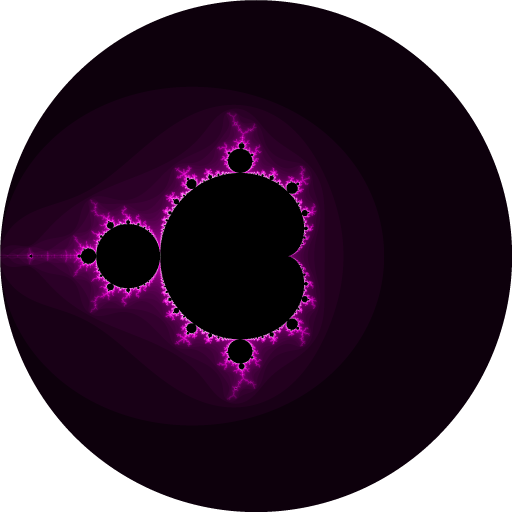
With what we’ve talked about so far, we can make a very crisp, black-and-white version:

That’s cool and all, but normally when you see the Mandelbrot set there’s more going on than this. What info do we have to visualize?
Escape Time
One thing we can visualize is the escape time - how many iterations it took for the point to escape the circle and bail out of the loop:

Here I’m just visualizing odd escape times in black and even ones in white (the set itself is drawn in white to match the previous picture). You can see that a fair chunk of the circle only takes one iteration before it fails the check, a tighter oval takes two, etc. As we get closer to the border of the Mandelbrot set, it takes longer and longer for the point to break out of the loop.
This is certainly more interesting, but it still doesn’t look much like how you normally see it.
Escape Time - Fancier!
This is more like it! Here I’ve taken the exact same data we saw on the previous image and mapped it to a simple color ramp instead.
Although this is a very simplistic version, visualizing the escape time is one of the most common ways you see the Mandelbrot set (or, more accurately, the points around the Mandelbrot set). For whatever reason, it seems to be extremely popular to visualize the poor thing using a 60s tie-dye or 70s van art aesthetic (don’t ask me). I’m sure you can already think of ways to make the above image more visually impressive by zooming in more, picking different colors, smoothing out the color gradients, etc…
Is there any other data we can visualize?
Let’s go back and review what we’re doing: for a given input point, we’re going to generate a series of points until it escapes (or not) the circle of radius 2. That series of points are sometimes referred to as the trajectory of the starting point.
Let’s visualize a trajectory:
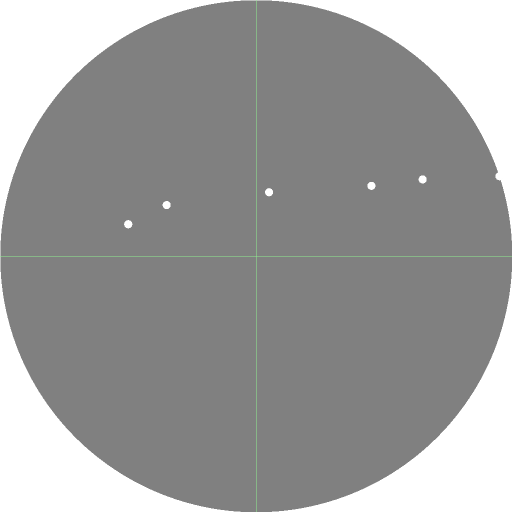
(Note that this is a totally made up example! If you plot the trajectory of that real point it wouldn’t look like this)
Our completely-made-up trajectory starts on the left side and under iteration the points move rightwards until one escapes the circle. What if we used information from the trajectory itself?
Trajectory Visualizations
Let’s base the color intensity from the distance of the closest point in the trajectory to the origin, and the color hue from the angle of that point from the real axis (X-axis):

Well, uh, let’s try to ignore that what I did ended up looking like an abstract Oscar Mayer nightmare and notice that we are getting some much weirder output. All those lines everywhere are called Pickover stalks, which is another rabbit hole you can explore.
The point I want to emphasis is that all these visualizations are using the same data that we’ve already seen how to generate. The complex nature of the output comes from the magical nature of the Mandelbrot set itself; how complicated you want to get in your visualization technique is up to you.
OK, so what about the Buddhabrot?
With the information we’ve learned we can now introduce the Buddhabrot:

First of all you’ll notice that the Buddhabrot is always displayed rotated 90 degrees (it looks nicer that way). The Buddhabrot technique was first described by Melinda Green in 1993. It’s kinda-sorta reminiscent of Buddhist/Hindu artwork and if you squint at it just right you might see a kneeling Buddha figure, hence the name.
The Buddhabrot is a density plot of trajectories from points that are not in the Mandelbrot set.
Let’s unpack that:
- We’re going to start with only the points that are not in the Mandelbrot set; i.e. they escape the circle of radius 2 after some number of iterations.
- That iterated series of points is called the trajectory of the starting point.
- We’re going to take those trajectories and keep track of which pixels they visit. For each point in a trajectory, we’ll figure out the pixel location that it corresponds to and increment that location by 1.
- The final image is a visualization of how often each pixel location was visited by a trajectory. In the above image, brighter pixels were visited more often, while the black areas were totally skipped.
I cheated in the above definition - the first step talks about “the points not in the Mandelbrot set” like that’s something that’s trivial to express. What that actually means in practice is that we’ll pick some random points inside of the circle, make sure that they’re not in the set, and plot their trajectories.
Why do we only plot the numbers that are not in the Mandelbrot set?
If you reverse it and only plot points in the set, you’ll wind up with the Anti-Buddhabrot:

This visualization is kinda interesting too (my rendering doesn’t quite do it justice), but it’s way more symmetrical and less chaotic.
Minimum Iteration Depth
Remember how the maximum iteration limit changed the appearance of the Mandelbrot set? Well, for the Buddhabrot, we also care about the minimum iteration limit:
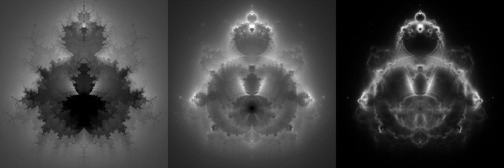
These are different renderings with a minimum escape count of 20, 100, and 1000. Any point that escapes the circle before that minimum limit is discarded. As you can see, increasing the minimum limit makes the Buddhabrot ‘crisper’ and reduces some of the noise. If you really crank up the minimum limit, you’ll start seeing some really cool stuff, as we’ll find out later…
Back to the code…
Sometimes it’s clearer to read code instead of words, so here’s a simple method to check whether a complex number should be plotted in the Buddhabrot:
public bool IsBuddhabrotPoint(Complex c, int minLimit, int maxLimit)
{
    var z = Complex.Zero;

    for (int i = 0; i < maxLimit; i++)
    {
        z = z * z + c;

        // check if the point has escaped the circle of radius 2
        if (z.Magnitude * z.Magnitude > 4)
        {
            // Filter by the minimum iteration limit too!
            // Points that escape too fast are 'noisey'
            return i >= minLimit;
        }
    }

    // Point never escaped, so we think it's in the Mandelbrot set
    return false;
}
Nebulabrot
You can actually utilize the effects of changing the minimum iteration limit to make yet another variation called the Nebulabrot:
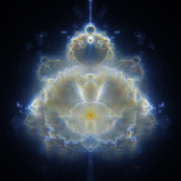
This looks pretty ‘spacey’ because it’s similar to how NASA generates false-color images of things like galaxies from radio waves - each color channel is a rendering of the Buddabrot with a different minimum iteration limit.
If you’re wondering about those weird ghostly boxes everywhere - well, they’re actually artifacts from an optimization we’ll cover in a later part. If I find the motivation I should probably re-render this guy to get rid of those, but for a much more impressive version, check out the one by Scott Seligman.
Effects of the Number of Points
In addition to the maximum / minimum iteration limits, another variable that is very important for the Buddhabrot is the number of trajectories we plot:
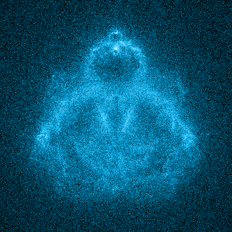
Remember that we’re visualizing a density map of how many times each pixel location has been visited. If we don’t plot enough points, our map will be extremely noisy like the above image. The above image might also be what happens if you try to simply iterate over every pixel location and plot the trajectory of the corresponding point. We need a lot more points than that, which is why we have pick random starting points (you can estimate which points you should iterate to get an image using a technique like the Metropolis-Hastings algorithm, but that’s a pretty advanced topic that I haven’t delved into much).
Summary - The Buddhabrot is Slow!
Let’s wrap up this part by summarizing what we’ve learned so far:
- A high minimum iteration limit will result in a cooler Buddhabrot
- The Buddhabrot needs a lot of points to not look noisy
- Unlike the normal Mandelbrot visualization, there is not a 1:1 mapping between points and pixels
A normal Mandelbrot visualization can be done in real-time (or close to it). There are lots of fractal viewer programs you can download to play around with it. One popular thing to do is to zoom in at incredible magnifications, which is feasible because every pixel in the output corresponds to one complex number. Making a rendering at 1x or 100,000,000x magnification is the same effort (minus any overhead from using an arbitrary-precision data type) - it’s the same number of pixels, so it’s the same number of complex numbers to iterate.
Not so for the Buddhabrot. Because we don’t know which starting points will contribute to a particular pixel location, zooming in real-time is not feasible. It’s actually much conceptually simpler to pre-render a gigantic version of it and zoom in after-the-fact. Since we don’t know (yet!) where the points are that contribute to a particular pixel, we pick the starting points at random from inside the circle.
My particular version has the following stats:
- Minimum iteration limit: 1,000,000
- Maximum iteration limit: 5,000,000
- Size: 68,719,476,736 pixels (262,144 x 262,144)
That’s a lot of work! If we want to get this done before the heat death of the universe we’ll have to some ways of speeding it up…